
readwithpride.com
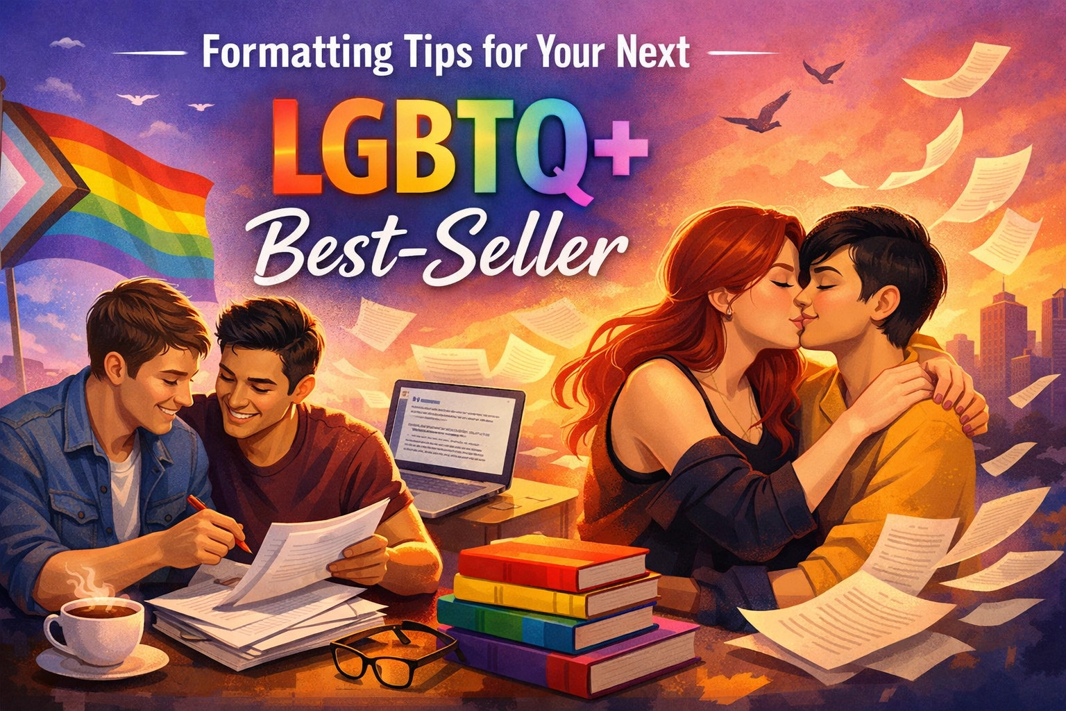
So, you’ve done it. You’ve spent late nights fueled by caffeine and pure queer joy, pouring your heart into the next great MM romance book or a gripping gay thriller. The characters are vibrant, the tension is palpable, and the "happily ever after" (or the devastating "happily for now") is finally on paper. But before you hit that upload button on Readwithpride.com, there is one final hurdle that separates the amateurs from the pros: formatting.
We’ve all been there, you download a highly recommended gay romance novel, settle into bed, and realize the text is a chaotic mess. Indents are missing, chapters bleed into each other, and the font is so tiny you need a literal magnifying glass. At Read with Pride, we want your LGBTQ+ ebooks to shine as brightly as the stories within them.
The best part? You can publish your first 10 books on our marketplace for absolutely free. The only catch? Your work must be LGBTQ+ inclusive. Since you're here, we're guessing that’s already your specialty. Let’s dive into how to make your ebook look professional on every device, from an iPhone to a high-end e-reader.
The Foundation: Standard Manuscript Setup
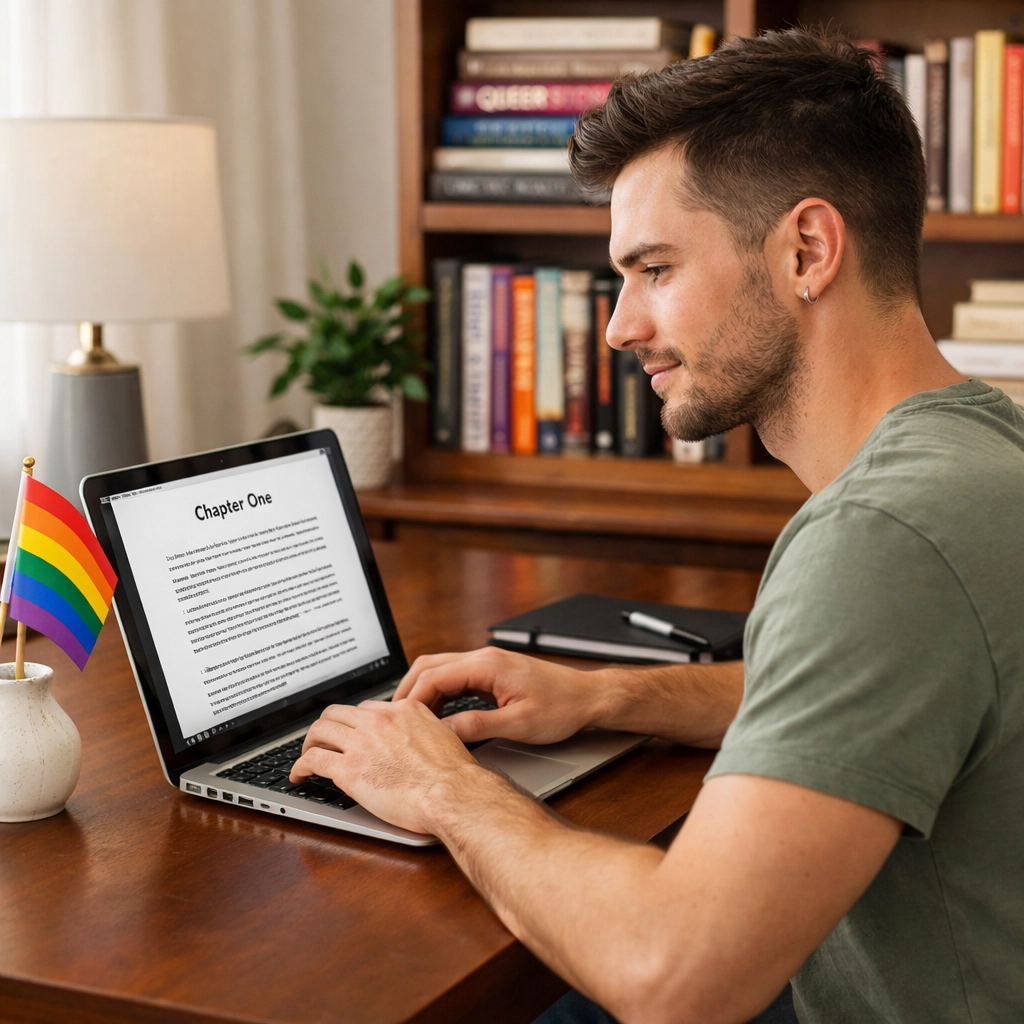
Before we talk about digital conversion, your base document needs to be clean. Think of this as the skeleton of your book. If the bones are crooked, the whole body will look off. Even if you’re writing steamy MM romance or emotional MM books, professional standards still apply.
- Margins and Size: Stick to the classic US Letter size (8.5 x 11 inches) with 1-inch margins on all sides. This keeps your workspace standard.
- Font Choice: While your ebook will ultimately let readers choose their own font, you should work in a clear, serif font like 12-point Times New Roman. It’s the industry standard for a reason.
- Spacing: Double-space your manuscript. It makes it easier for you to catch typos and gives the text room to breathe during the editing phase.
- The "One Space" Rule: This is a hill many writers die on, but please: only use one space after a period. The double-space after a period is a relic of the typewriter era and can create weird gaps (called "rivers") in digital formatting.
Master the Indent (And Ditch the Tab Key)
If there is one technical tip that will save your sanity, it is this: Never use the Tab key for indents.
When an e-reader encounters a "Tab" character, it often doesn't know what to do with it. This results in some paragraphs being indented halfway across the screen while others stay flush left. To ensure your gay fiction looks uniform:
- Use your word processor’s "Paragraph" settings.
- Set a "First Line Indent" of 0.5 inches.
- Apply this to your "Body" style.
By using styles rather than manual tabs or spaces, you ensure that whether a reader is enjoying your gay contemporary romance on a Kindle or a laptop, the paragraphs look exactly as they should.
The Magic of Page Breaks
Nothing screams "amateur" louder than a new chapter starting in the middle of a page because the author hit "Enter" twenty times to get to the next screen.
In the world of LGBTQ+ ebooks, navigation is king. You want your readers to be able to jump to their favorite spicy scene or that heart-wrenching climax with ease. Always use a "Hard Page Break" (Ctrl+Enter or Cmd+Enter) at the end of every chapter. This tells the ebook file to stop and start fresh on a new screen, regardless of the device’s screen size.
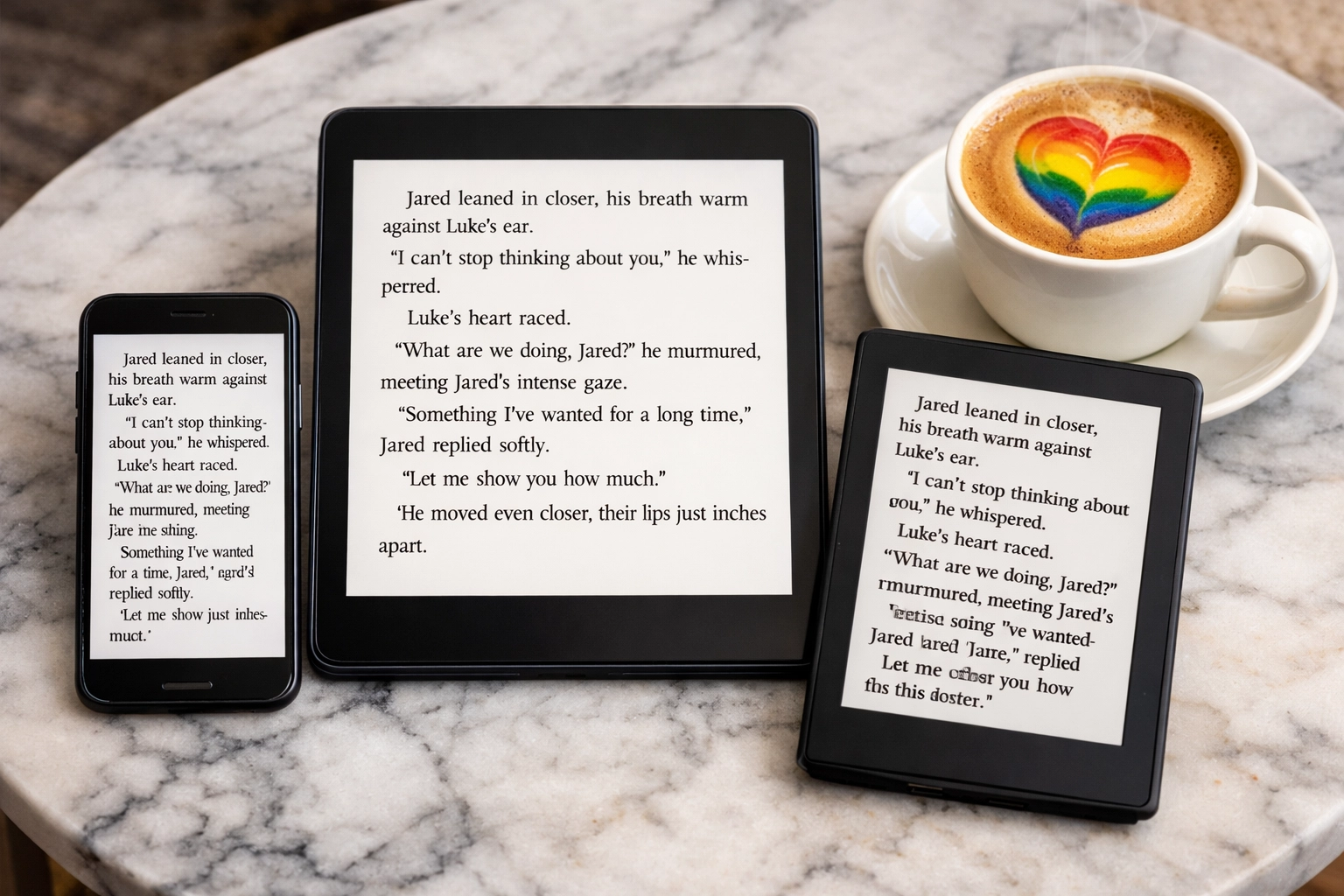
Reflowable vs. Fixed Layout
For 99% of gay books, you want a reflowable layout.
"Reflowable" means the text is like water: it fills whatever container it’s in. If a reader increases the font size on their phone, the text "reflows" to fit. This is essential for gay romance novels and queer fiction.
Fixed layouts are generally reserved for image-heavy books like coffee table books or graphic novels. If you are publishing M/M books that are primarily text, stick to reflowable. It’s the gold standard for accessibility and user experience.
Crafting a Professional Table of Contents (TOC)
A working Table of Contents isn't just a "nice to have": it’s a requirement for a professional reading experience. Readers expect to be able to click "Chapter 5" and be whisked away immediately.
Most modern word processors can generate an automatic TOC based on your "Heading" styles.
- Mark your chapter titles as "Heading 1" or "Heading 2".
- Insert an automated Table of Contents at the beginning of your book.
- When you convert to EPUB or upload to Readwithpride.com, these headings become the navigation links.
Front and Back Matter: Building Your Brand
Your book isn't just the story; it’s a marketing tool. The "Front Matter" (everything before the story starts) and "Back Matter" (everything after) are where you turn a casual reader into a superfan of your gay literature.
Front Matter Checklist:
- Title Page: Title, subtitle, and your name.
- Copyright Page: Protect your hard work.
- Dedication: Give a shout-out to your community or that one person who inspired your MM romance.
Back Matter Checklist (The most important part!):
- About the Author: Keep it authentic and relatable.
- Other Works: List your other MM novels or gay love stories.
- Mailing List Link: This is vital. You want readers to know when your 2026 gay books are dropping.
- Social Media: Direct them to your profiles.
Don't forget to link back to your store on Readwithpride.com!

Image Optimization for Covers and Beyond
A stunning cover is what makes a reader stop scrolling. For gay romance books, the cover often signals the trope: whether it’s enemies to lovers MM romance, forced proximity, or a slow burn.
To ensure your cover looks crisp:
- Use a high-resolution image (minimum 2,813 x 4,500 pixels for ebooks).
- Keep text readable even when the image is a tiny thumbnail.
- Avoid placing important text or faces too close to the edges.
If you include internal images (like maps for gay fantasy romance or diagrams for a gay thriller), make sure they are high-contrast and clear. Remember, many e-readers are still grayscale (black and white), so your images need to look good without color.
Testing, Testing, 1, 2, 3
Before you declare your new gay release ready for the world, you must test the file. Download an ebook previewer or send the file to your own devices.
- Does the font look okay?
- Are the links in your back matter clickable?
- Do the chapter headings look consistent?
- Is the MM contemporary vibe preserved across different screen widths?
Why Publish with Read with Pride?
The world of LGBTQ+ fiction is massive and growing. While big retailers are great, there is something special about a dedicated community. At Readwithpride.com, we aren't just a marketplace; we are a hub for gay authors and queer authors to thrive.
With our "first 10 books for free" offer, there is zero risk in trying us out. We prioritize popular gay books and top LGBTQ+ books, ensuring that readers looking for steamy MM romance or heartfelt gay fiction find exactly what they need.
Whether you're writing gay historical romance, gay spy romance, or an award-winning gay fiction piece, your work deserves a professional presentation. Following these formatting tips ensures that your voice is heard: clearly, beautifully, and without technical distractions.
Ready to see your name in the "New Releases" section? Head over to our FAQ or Ask a Question if you get stuck. We can't wait to read what you've created!
Join the conversation and stay updated on the latest in queer publishing:
- Facebook: Read with Pride
- X (Twitter): @Read_With_Pride
- Instagram: @read.withpride
Happy writing, and even happier publishing! 🌈✨
#Readwithpride #MMRomance #LGBTQBooks #GayFiction #SelfPublishingTips #QueerAuthors #GayRomanceNovels #2026GayBooks #MMRomanceBooks #GayLiterature
Leave a Reply
You must be logged in to post a comment.