

readwithpride.com
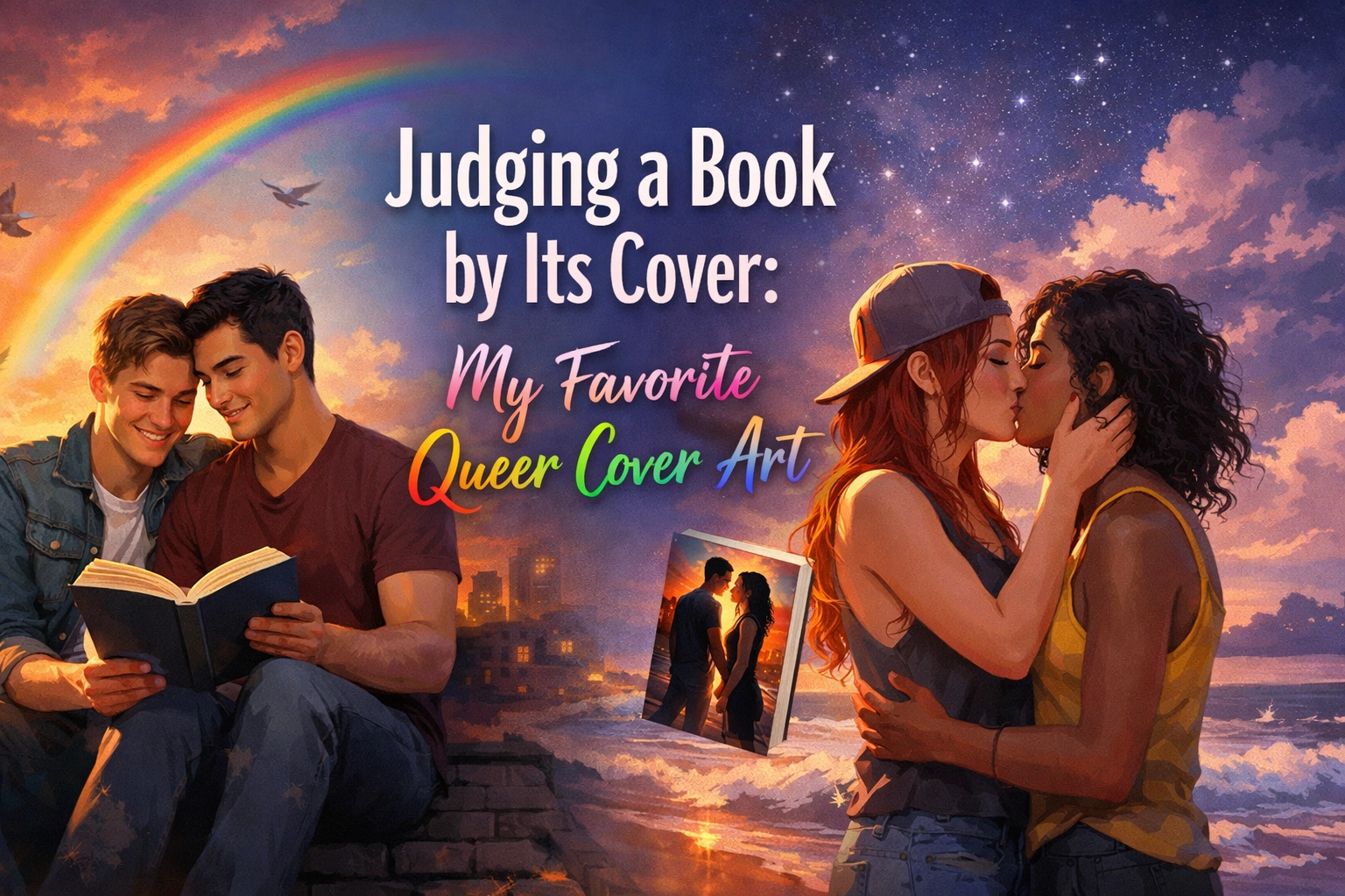
Let’s be honest for a second: the old "don’t judge a book by its cover" adage is the biggest lie ever told in the literary world. We all do it. We do it at the bookstore, we do it while scrolling through LGBTQ+ ebooks on our phones, and we definitely do it when we’re deciding which MM romance books to add to our physical shelves. A cover is a first date. It’s the visual "vibe check" that tells us if we’re in for a heart-wrenching tragedy, a steamy slow-burn, or a cozy fantasy world where being queer is as natural as the sunrise.
At Readwithpride.com, we live and breathe the intersection of art and identity. For decades, queer literature was forced into the shadows, with "coded" covers that only those in the know could decipher. Today, we are living in a golden age of queer design. From bold, illustrated portraits to intricate symbolic motifs, queer cover art has become a legitimate movement in graphic design.
The Evolution: From Coded to Bold
If you look back at vintage gay fiction or "pulp" novels from the mid-20th century, the covers were often designed to be sensationalist or purposefully vague. Fast forward to 2026, and the landscape is unrecognizable. We aren't just seeing representation; we are seeing celebration.
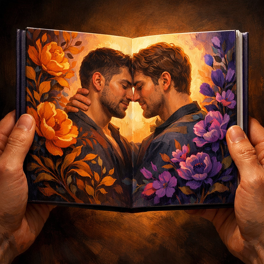
Modern queer covers often utilize specific visual languages. Research shows that many contemporary queer YA and adult novels are leaning into warm autumnal color schemes: think burnt oranges, deep purples, and rich golds. There’s a sense of "finding home" in these colors. Furthermore, the rise of the illustrated cover has completely changed the game for MM romance and gay novels. Instead of the stock-photo models of the early 2010s, we now get bespoke artwork that captures the specific soul of the characters.
Icons of Visibility
When we talk about my favorite queer cover art, we have to mention the heavy hitters that changed how publishers approach LGBTQ+ fiction.
- Felix Ever After by Kacen Callender: This is a masterclass in visibility. Featuring a Black trans boy with visible top surgery scars against a vibrant red and yellow background, it doesn't just ask for space: it demands it. It’s a gorgeous piece of art that reflects the interior strength of the story.
- The Mermaid, the Witch and the Sea by Maggie Tokuda-Hall: For the fans of gay fantasy romance, this cover is legendary. It depicts a genderfluid pirate in such intricate detail that you find something new every time you look at it.
- All Boys Aren't Blue by George M. Johnson: This cover brilliantly uses the pink and blue of the trans flag, softened with yellow flowers. it’s a perfect example of how color theory can tell a story of intersectionality before you even read the first page.
The Most Anticipated MM Romance Releases 2026: The New Visual Standard
As we look ahead, the most anticipated mm romance releases 2026 are pushing the boundaries even further. We’re moving away from the "two guys standing near each other" trope and moving toward high-concept art.
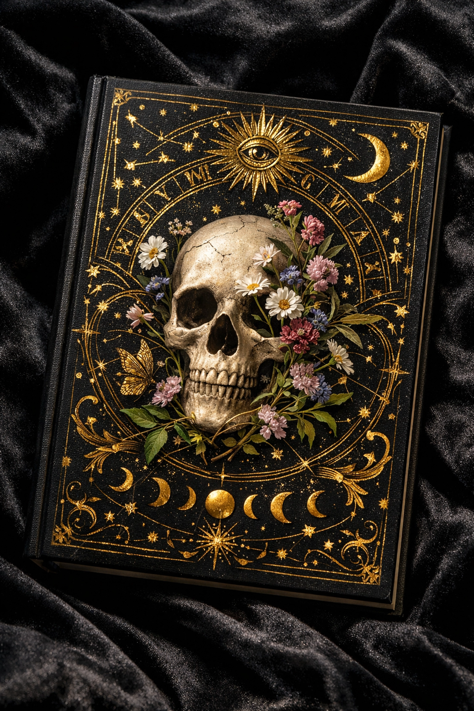
In the upcoming 2026 slate, we’re seeing a massive trend toward "symbolic maximalism." Think skulls paired with delicate wildflowers for gay psychological thrillers, or celestial maps for MM historical romance. These covers aren't just selling a story; they’re selling an aesthetic. Whether it's a "forced proximity" trope or an "enemies to lovers MM romance," the art is becoming more sophisticated.
For example, many of the 2026 gay books are opting for "soft butch" aesthetics or "queer joy" illustrations that focus on touch and intimacy rather than just physical perfection. This shift makes gay love stories feel more grounded and authentic, which is exactly what our community is asking for.
Why Art Matters for LGBTQ+ Ebooks
You might think that because you’re reading on a Kindle, the cover doesn’t matter as much. I’d argue the opposite. When you’re scrolling through a sea of LGBTQ+ Kindle books, a thumbnail has about 0.5 seconds to catch your eye.
A great cover for a gay romance series needs to be readable at a small scale but detailed enough to satisfy when it’s full-screen. This is where "Read with Pride" shines: we curate stories that not only have incredible prose but also visual identities that make you proud to have them in your digital library.
The Tropes We Love to See Visualized
Let’s talk about how cover art communicates tropes. You can usually tell the "flavor" of a gay romance book just by the font and the framing.
- The Slow Burn: Often features plenty of "negative space," perhaps two characters on opposite sides of the cover, looking toward the same horizon. It builds the tension before you even crack the spine.
- The Steamy MM Romance: Bold, high-contrast colors. Often featuring close-up details: a hand on a waist, a shared glance. It’s about the heat.
- The Gay Adventure Romance: These are currently leaning into the "travel poster" style. Think bold blocks of color, silhouettes, and a sense of movement.
At Readwithpride.com, we’ve noticed that our readers are particularly drawn to covers that feature "Found Family" vibes: multiple characters, messy settings, and a sense of community.

Building Your Own Queer Library
If you’re a physical book collector, your "queer shelf" is a testament to your journey. Many of us use our books as a form of home decor. There’s nothing quite like a row of MM novels with spines that create a rainbow gradient.
If you're looking to upgrade your collection, I highly recommend checking out some of our featured titles like The Swordsman's Compass or The Transaction of Self at Read with Pride Store. These titles aren't just great reads; they look stunning on a nightstand.
The Future is Graphic (Literally)
As we move deeper into 2026, keep an eye out for more queer graphic novels and manga. The crossover between traditional gay literature and visual storytelling is blurring. We are seeing more "hybrid" books where the cover art style carries through into internal illustrations. This is especially true for gay fantasy and MM historical romance, where the world-building is so rich it requires visual aids.
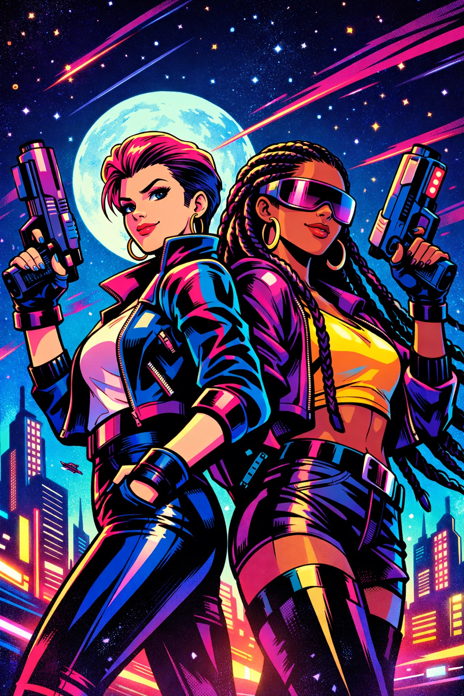
The most anticipated mm romance releases 2026 are also embracing a "retro-future" look: combining 90s nostalgia (think neon and chunky fonts) with modern, inclusive character designs. It’s a vibe that feels both familiar and revolutionary.
Join the Conversation
We want to know: what is the one book you bought solely because you loved the cover? Was it a gay contemporary romance that looked like a piece of modern art? Or an MM fiction title with a cover so beautiful you had to have the hardback?
Art is subjective, but queer art is personal. It represents our struggle, our joy, and our future. When you support queer authors and publishers who invest in high-quality cover art, you’re helping to ensure that our stories continue to be told with the dignity and beauty they deserve.
Stay tuned to Readwithpride.com for more deep dives into the world of LGBTQ+ publishing. Whether you’re looking for new gay releases or the best MM romance of the decade, we’ve got you covered.
Follow us for more queer bookish content:
Explore more on our website: readwithpride.com
#LGBTQBooks #QueerArt #MMRomance #ReadWithPride #BookCoverDesign #GayFiction #2026Releases #GayRomanceNovels #BookTok #QueerLiterature #MMRomanceBooks
Leave a Reply
You must be logged in to post a comment.