
readwithpride.com
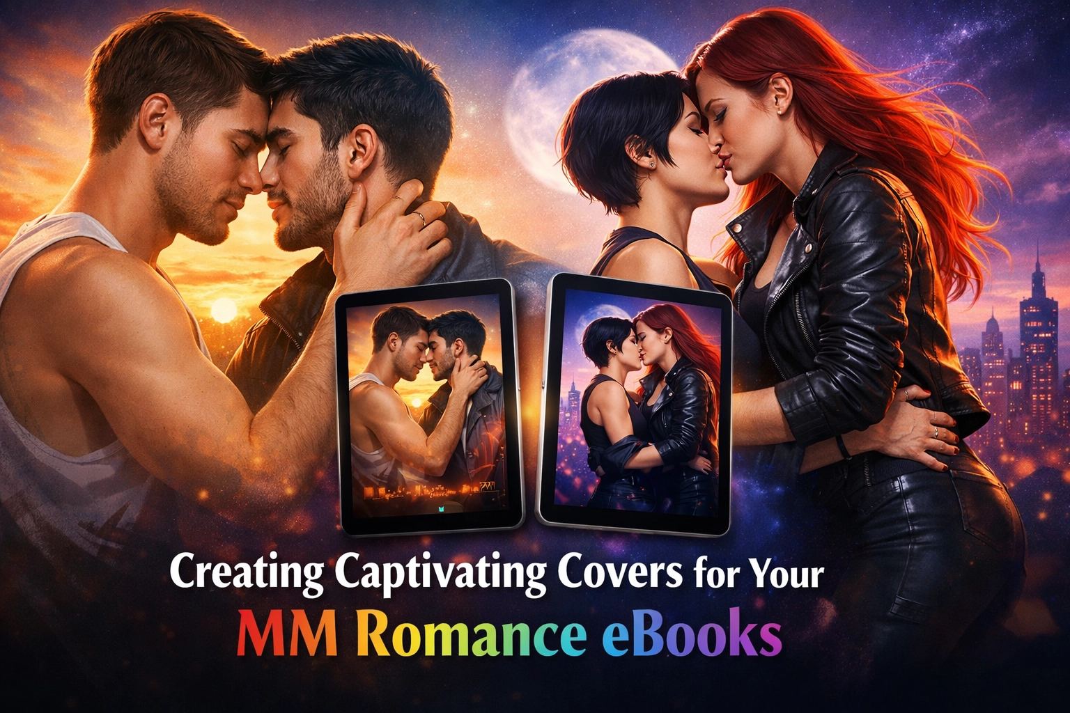
Let’s be honest: we all judge a book by its cover. You can spend months, even years, perfecting every spicy encounter and every emotional breakthrough in your MM romance books, but if the cover looks like it was slapped together in a 2005 version of MS Paint, readers are going to scroll right past it. In the fast-paced world of digital publishing, your cover is your handshake, your pickup line, and your first impression all rolled into one.
At Read with Pride, we know that the LGBTQ+ fiction market is booming in 2026. Readers are hungrier than ever for authentic gay love stories, but they’re also more discerning. They want professional-quality visuals that tell them exactly what kind of ride they’re in for. Whether you’re writing a steamy MM romance or a heartfelt gay fiction piece, your cover needs to scream "Read Me!"
If you’re ready to share your voice with the world, our marketplace is the perfect place to start. On Readwithpride.com, you can buy e-books or become a creator yourself. The best part? You can publish your first 10 books for free, provided they are LGBTQ+ thematic. It’s our way of making sure the community has a platform to shine without the gatekeeping.
Why Visual Appeal Matters in Gay Romance
The gay romance novels community is incredibly visual. Unlike some genres where a minimalist or abstract cover might work, MM romance often relies on character chemistry. Readers want to see the vibe. Is it a gay historical romance with brooding lords? Or a gay contemporary romance set in a bustling city? The cover sets the expectations.
When a reader browses our product-sitemap1.xml, they are looking for cues. If your cover doesn't match the genre tropes, you’ll lose potential fans. A cover that looks like a gay thriller but contains a slow burn romance will lead to bad reviews because the "promise" of the cover wasn't kept.
1. Color Theory: Setting the Mood
Color is the first thing the human brain processes. In MM romance, your palette tells the reader how the story will make them feel.
- Reds and Golds: These are the hallmarks of passion, heat, and "enemies to lovers" energy. If your book is a steamy MM romance, don't be afraid of bold, warm tones.
- Blues and Purples: These suggest mystery, melancholy, or a deep, soulful connection. Perfect for emotional MM books or a gay psychological thriller.
- Bright Pastels: Ideal for "fluff," rom-coms, and "sweet" gay love stories.
- Dark Grays and Blacks: Best suited for gay spy romance or gay adventure romance where the stakes are high and the shadows are deep.
When designing for Readwithpride.com, try to stick to 2–3 main colors to keep the design from looking cluttered. You want a cohesive look that pops against the white or dark mode background of an e-reader.
2. Typography: Make It Legible
You’d be surprised how many great gay novels are hidden behind unreadable text. Your title and your name need to be clear even when the cover is the size of a postage stamp.
- Font Choice: For MM fantasy, go with something elegant or slightly weathered. For MM contemporary, a clean sans-serif font often looks modern and sleek.
- Hierarchy: The title should be the biggest thing on the page (unless you’re a mega-famous author, but let's focus on the title for now!).
- Contrast: If your background is dark, use light text. If your background is busy, use a text box or a drop shadow to make the letters stand out.
Remember, most people will discover your work on their phones. If they can't read the title while scrolling through the blog_post-sitemap1.xml or a category page, they won't click.
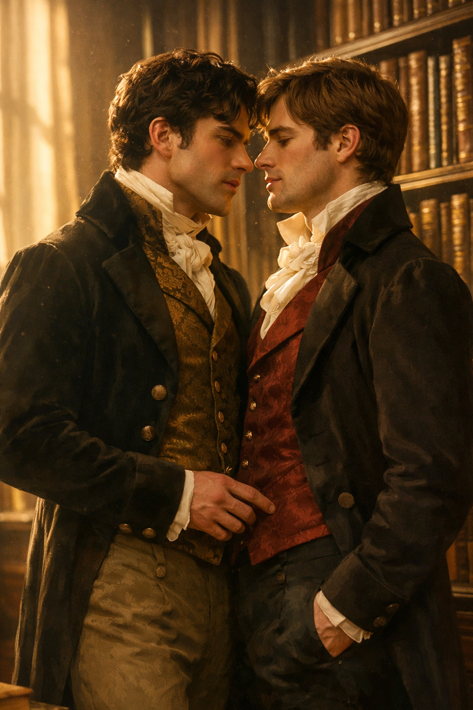
3. Hitting the Tropes Visually
In the world of MM romance books, tropes are king. Readers often search for specific "vibes," and your cover can signal these instantly.
- Enemies to Lovers: Think of characters standing back-to-back or looking at each other with intense, fiery expressions.
- Forced Proximity: Use imagery that feels "closed in", maybe characters sharing a small space or a singular umbrella.
- Slow Burn: Soft lighting, lingering glances, or hands nearly touching can signal a beautiful, agonizing wait for that first kiss.
- The "Headless Man" vs. Illustrated: In 2026, we’re seeing a huge trend in illustrated covers for gay romantic fiction. They feel whimsical and modern. However, the "shirtless torso" (the classic headless man) still dominates the steamy MM romance charts because it promises exactly what's inside.

4. Imagery and Composition
High-resolution imagery is non-negotiable. If you’re using stock photos, make sure they don't look too stock. Avoid the cheesy, over-posed photos that have been used on a thousand other M/M books.
If you can afford it, hiring an illustrator who specializes in queer fiction is a game-changer. Custom art allows you to represent your characters exactly as you wrote them, whether they are diverse in body type, ethnicity, or gender expression. At Read with Pride, we celebrate all forms of gay literature, and seeing that diversity on a cover is incredibly powerful for the community.
5. The Thumbnail Test
Before you hit "publish" on your dashboard, do the thumbnail test. Shrink your cover design down to 100 pixels wide.
- Can you still see the characters?
- Is the title still readable?
- Does the "vibe" still come through?
If the answer is no, you need to simplify. Overcomplicating a cover is a common mistake for new MM authors. Keep it focused on one or two main elements.
Publishing on Readwithpride.com
Once your cover is ready and your manuscript is polished, it’s time to show it to the world. Our platform is designed specifically for the LGBTQ+ community. We aren't just a marketplace; we are a hub for queer authors to thrive.
As mentioned, you can publish your first 10 books for free! Whether you're writing a gay historical romance, MM fantasy, or a gritty gay thriller, as long as it's thematic to our community, we want to host it.
Designing a cover is part of the storytelling process. It’s the bridge between your imagination and the reader's heart. Take your time, look at what’s popular in the best MM romance lists of 2026, and create something that reflects the beauty of your story.
Ready to get started?
Check out some of our current favorites like The Transaction of Self or The Swordsman's Compass to see how other authors are rocking their cover designs.
Don't forget to follow us and join the conversation!
- Facebook: Read with Pride
- X (Twitter): @Read_With_Pride
- Instagram: @read.withpride
Your story deserves to be seen. Make sure your cover gives it the best chance possible. Happy writing and happy designing! 🏳️🌈✨
#MMRomance #GayRomance #LGBTQBooks #QueerFiction #BookCoverDesign #SelfPublishing #ReadWithPride #GayAuthors #MMBooks2026 #IndieAuthor

Leave a Reply
You must be logged in to post a comment.